Wednesday 14 December 2011

Music Portraiture - Evaluation

My client was Nat Blair, a guitar player from Suffolk new college who played and listened to rock music. He wanted pictures with him and his guitar to show he was a musician and admired existing photographs of performers captured backstage. He was also a fan of strong contrast added in the editing stages after the shoot itself. I therefore kept these requirements in mind when planning the shoot and layout.
The location I chose to shoot in was the TV studio of the college as this provided me with a plain background with extensive lighting options and space to move and capture the shots I wanted. I believe that as I tried out many different angles and shots during the shoots that I gained a variety of options for my final photos and am happy with the results. I used a spotlight with some soft background lighting to make the contrasts between light and dark as extreme as possible which was inspired by the artist’s work I researched for this project. It also gave a perfect balance between an onstage and backstage feel to the photo which is what I wanted to achieve. When editing my images on Photoshop I concentrated on increasing the contrast or decreasing the saturation to create really strong colours or black and whites. I cropped most of the photos so they were close around the main subject, giving the picture the personal touch that captured moments backstage have, almost so close that the music he is playing on his guitar could be heard.
I chose the final image in the layout for exactly those reasons stated above and I thought it conveyed the client’s personality well whilst still representing him as an artist. When further editing the image I used the dodge and burn tool to accentuate the difference in tones, using it on the white and black squares on his shirt, the guitar’s details and other small details that I wanted to stand out. I positioned the title (“Nat Blair”) at the bottom as it stands out on the black well and follows the line of his leg. This was purely an artistic choice as when trying to fit the text at the top of the page it looked clumsy and unprofessional. It also supports represents a signature style signing that is common at gigs, relating again to the backstage aspect. The contour and shadow effects I used on this text helped the letters to sit in the page rather than lying over the top of the photo. The text on the opposite page is simple and doesn’t detract from the main image as I wanted the picture to say more about him than the information. I chose to position the text there as it is different to the normal layout of a magazine double page and its visually interesting and a manageable size that would encourage a reader to stop and take notice rather than be overwhelmed by a large amount of writing.
Overall I am happy with the final images and layout. If I was to do the project again I would hope to get a range of locations for different shots, for example an on stage shot to balance the backstage ones. An opportunity for this did once arise but travel arrangements and communication problems between me and the client meant I was unable to gather these shots along with what I had already shot. However I believe the shots achieve what the brief and my client asked for and the final layout is a good enough standard to give back to the musician himself.  

Music Portraiture - Final Layout

This is the final version of the layout...

Saturday 10 December 2011

Music Portraiture - Planning My Layout

These are 3 different layout design ideas that I have created. I have used letters to resemble where in the layout the final text will be. They were all made with magazine double page layouts in mind however they could also work on a small advertisment poster, alongside a CV or as part of an event promotion text. The last photo is just a trial for a picture that could be used inside a CD panflet.


Monday 28 November 2011

Photography Shooting Schedule


  • 9am – Collect Camera from Tim in studio
  • 9.15 am – Meet Musician
  • Head to location and set up lighting
  • 9.20-11.10 am - Shoot
  • 11.15 – Return Camera

Equipment – SLR Camera, SD Memory Card, (Lights already fixed in the studio)

Location – TV Studio, Suffolk New College

Saturday 19 November 2011

Photography - Research cont...

This portrait is of the rock singer Hayley Williams, a member of the band Paramore. The moment at which the photographer has captured Hayley (whether it was natural or directed) shows her crazy expression which represents her wild personality, commonly linked with rock performers. We instantly connect with her through the photo as you understand who she is a little more, which is very important in music portraits especially when used on album covers or in promotion for tours etc. The colours are strong in the image to bring out her bold hair, again supporting her rock image. The lighting and contrasts are not harsh giving the photo a really true and genuine feel to reflect the genuine moment the photographer has supposedly captured. The framing sees her in the centre of the picture as the main focus, and so the viewer is instantly drawn to her face and expression in the close up shot. I think the photo is very effective as it really represents the artist well and the colours and composition are visually attractive to look at.

Photography portrait of music artist Hayley Williams


Photography - Research cont...

This studio portrait of rapper, Snoop Dogg shot by Steven Taylor captures the musician in very personal and true moment. The composition of just him tells us he is a solo singer and not part of a band. The simplicity of the framing again captures the intimacy of the photo as nothing detracts from the connection Snoop Dogg is making with the lens. The shot is very close to the artist and it creates the feeling that we are seeing behind the facade of the fame and fortune to the real person behind it all. The simple black and white style also supports this and the strong contrast levels highlight the smoke coming from the cigarette and his mouth. This is a recognisable symbol related to rap music and we can straight away tell what genre of music he is from. The lighting is quite strong, focused and harsh which allows the contrast levels to have the best effect and really exaggerates the contours of his body. The main attention of the photo is the artist himself, with his “gangster” style and image coming across in the photo rather than his musical talent. I think the image is very effective as it’s visually striking but also tells the story of the artist which is imperative in a musician’s portrait as it connects the talent, such as Snoop Dogg, with their audience. For example, if he was photographed sat behind a piano smiling, we would have a very different view of him as an artist.

Snoop Dogg portrait by Steven Taylor


Thursday 17 November 2011

Photography - Research Continued...

MICHAEL ROBERT WILLIAMS

Michael Robert Williams is from Congleton, south of Manchester in North West England. He later moved to London and had gained a photography degree. Still based in London, today Michael is well known for his portraits of musicians, including The Killers, Oasis, Kasabian, La Roux, Ellie Goulding, Pixie Lott, Biffy Clyro, Kaiser Chiefs, and other celebrities from the worlds of sport, film, and music. In addition to portraits for magazines Michael has produced artwork and promotional images for record labels and artist management, and commercial clients including Adidas and Philips. An example of his work is below...

LA ROUX - Portrait by M.R.Williams 2010

Williams’ portraits are quite the opposite of Nick Pickles’ as he concentrates on the visual image of the artist, their styling mostly. His photos capture colours, shapes and settings that reflect the artist and their music. In this photo of singer La Roux, he uses a strong colour contrast between the white of the background and the colourful styling of the singer to represent how she stands out from the ordinary scene of pop artist as a person and singer. The lighting is very bright to give the white background and her pale skin the dazzling effect it achieves. The framing puts the artist in the middle of the frame, meaning she dominates the picture, which is important for a solo singer as they don’t have a band to rely on in a shoot like this.


Wednesday 16 November 2011

Music Portraiture - Photographer Research

NICK PICKLES
Nick Pickles is a london-based freelance photographer travelling across the country to cover gigs, festivals and events for a wide range of clients. His previous roles have included being the house photographer at the 02 Academy Leeds for two years, as well as working with the BBC to cover various festivals for the past four years. He has contributed to several major agencies including Getty Images, WireImage, Retna and WENN. Pickles’ work has been used in a host of national and international publications, by bands for artwork and marketing materials and for private exhibitions. He specialises in live music photography, but has also done a range of corporate work, portraiture, reportage and commercial photography for numerous clients. In his music photography he captures real moments at live festivals and his photos convey the energy and vibe of the concert/performance. In pieces of his work such as the following examples, he catches moments that connect the viewer with the emotion of the music even though they can’t hear it and this is extremely effective in a live music portrait.

Nick Pickles image of Cee Lo Green at the 2011 Glastonbury Festival. This photo captures the power and intensity of the performer and the angle of the shot supports this. The framing is stylistic as it gives the artist looking room in the frame, giving the impression that he is looking out at a vast space, in this case the large crowd. We can now establish the scale of the performance from just this clever framing instead of just looking at the portrait of the artist. Pickles has also captured the theme of Cee Lo’s performance, by not including any other musical elements in the picture (e.g. the band) and choosing a moment where the “other worldly” lighting mixes with the on stage smoke. This again connects the viewer with the live performance and conveys the energy that was at the festival in just one still photograph.

Paloma Faith at 2011 Latitude Festival. Again the energy and vibe of her performance is captured here and very effectively as the close up portrait has caught a true moment of happiness on t he artists face that is supported by the strong, positive colours in the photo.


PHOTOGRAPHY - MUSIC PORTRAITURE

This studio portrait of guitarist George Karagioules shot by Andrew Mason captures the musician in an almost backstage, relaxed atmosphere. The composition of just him and his guitar conveys the personal story of the guitarist as it tells us what’s most important to him (the guitar). The simplicity of the framing again captures the intimacy of the photo as nothing detracts from the connection George is making with the lens. The simple black and white style also supports this and the strong contrast levels highlight the textures and contours of the guitar and the amp behind the main subject of focus. The lighting is quite strong, focused and harsh which allows the contrast levels to have the best effect and also gives the effect a spotlight would have, relating to the live performance element of the backstage themed photo.The main attention of the photo is the guitar and its importance and there is not a strong concentration on the musician’s personal musician, giving the impression that he wants to be known for his talent as a guitarist rather than his looks as a “front man”. I think the image is very effective as its visually striking but also tells the story of the artist which is imperative in a musicians portrait as it connects the talent, such as George Karagioules, with their audience.

Musician Photography in London by Andrew Mason. Studio portrait shot of guitarist, George Karagioules.


Friday 26 August 2011

TV ADVERT PRODUCTION - Task 4 - Planning For Pitch

Outline Proposal:
I am intending to plan and develop and advertising campaign behind a fizzy drink brand aimed at mainly girls (but also suitable for boys) aged 14-18. I propose to create a healthy alternative that appeals to students in the competitive existing market. My aim is to promote a fruity fizzy drink that is presented as an indescribable, fresh, new choice in between the vast numbers of unhealthy, sugar and caffeine filled bottles already on the shelves. The main focus should be on the fruit itself taking the colours of the ingredients as a palette for my typeface and logo. My idea should be marketed as new and suitable for all kind of teenage social occasions such as breaks between classes and lectures, at the cinema, at the park with your friends and many more. The concept of happiness in summer will run strongly through all design aspects.
Brand:
Logo – using the fruits used in the actual drink I arranged a compact logo that is bright and eye-catching to stand out on the shelf. I played around with different arrangements until the items came together as a logo rather than a collection of pictures accompanied by the brands name. The three colours of the Z's resemble the three fruits in the drink. This could easily lead to an extension of the product range. For example, another Fizzz drink with strawberry, kiwi and peach flavours could use green, red and 'peach' as a colour scheme for its typeface.


Slogan – As the drink is promoted as quite pure with simple ingredients I wanted to reflect this in the slogan. It’s also catchy and memorable as its short and uses loose alliteration.
It’s Fresh. It’s Fruity. It’s Fizzz.

Typeface and colours :
 The font I have used for the logo and slogan is “Segoe Print” as I believe its young looking and fun but still simple enough to be legible. The text as it’s bold and unisex as not to stereotypically target either sex as my product will be perfectly suitable for both boys and girls. The colours are warm and happy which supports the theme of summer and carefree happiness that I’m trying to create.
Imaginary Profile of target audience:
Name- ‘Alexis’                                  Age- 16                                 Occupation- Student        
Hobbies- hanging out with friends, cinema, reading, writing music                                
Favourite music- mainstream indie and rock                                    
Lifestyle- quite busy with college and social occasions, but always makes time for her friends                                      
Lives in town with a middle class family and younger siblings                                 
Wears in style clothes with her own personal touches, finds her health and diet important but is still just as casual as any another teenager                                    
Outlook on life- always optimistic, loves summer, just wants to have fun and be comfortable in her own skin and around her friends.
Synopsis:
A student just like me and you stands in front of a camera and a plain white background and struggles to describe the drink they just tasted. They can’t find the words because the drink is so new and superior to any others before it that no words exist to describe it. In between these shots of people will be extreme close ups of the fruit used in the drink, whether its an orange being cut in half or a semicircle of a watermelon held in front of someone's face as a smile. Every now and then a shot of the drink itself will also appear, with the camera so close that the bubbles of ‘FIZZZ’ can be seen by the audience.  The cuts will be short and fast with the whole vibe of the advert relating to the warmth and happiness of sunny summer days.
Treatment:
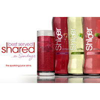
‘Fizzz’ (my fizzy drink brand) is a fun, fruity fresh drink aimed at students. Whether it’s at the cinema, on the park catching some rays or in a study session, Fizz is perfect for that naturally uplifting break students need. Made from real watermelons, oranges and lemons, you can carry around the sunshine of summer in a bottle! ‘Fizzz’ can be compared to nothing else out there, it’s that good! So try and describe it after you’ve tasted the bursting brilliance of flavours and the tongue tingling fizz because we believe there are no words out there that can really convey the intensity of FIZZZ.  I want to capture this happiness and concept of summer in the advertisement. I came up with the name as a sort of play on words as soft drinks are sometimes referred to as ‘a bottle of fizz’ and so by putting another Z on the end it becomes a brand name, you can actually ‘buy a bottle of Fizzz’.
The target audience of my advert is obviously therefore students aged 14-18, mainly girls but I will be trying to target both sexes. As students do not have a lot of money I will be marketing my product as mid market as not to stop my target audience actually affording what they see on the advert. I will target this audience by using students as actors in the advert, referring to teenage activities in the script, (e.g. “I drink it at the cinema/in between lectures!”) and writing the script from a teenager’s perspective so it sounds chatty and informal. Also, the song I will use to accompany the images and speech is by a band that is popular with many audiences including the imaginary profiler – ‘The Ballad of the Beaconsfield Minors’ by ‘FooFighters’. I will convey the fact that the actors are of student age by using any Mise-en-scene such as clothing to reflect this.
My advert will just be filmed in front of a plain white background to bring full attention to the words of the actors and the images of the product and its ingredients. The location of my shoot will be a photography or TV studio situated in college itself and so there will be no travel or hire costs, permitting that the studios are available for use. If they are already in use we would have to improvise with the plainest wall we could find. The budget for filming will be small as there are no travel concerns and the props (fruit and fizzy water mostly) should cost no more than £20 at most.
The keys shots of my advert will be CU’s and ECU’s of props, alongside MS’s and 2S’s of the actors. I want to create some really interesting scenes using the camera as well as post production editing such as cutting up the fruit and then rewinding the footage so the fruit comes back together again. The editing will be short and fast as I want to achieve as many shots as possible in the 30-40 seconds of air time we are given. They will be made up of creative shots of the fruit found in the drink to emphasis the presence of real fruit in the ingredients, subliminal message shots and people trying to describe the drink. The whole concept of the advert is that the actors cannot find the words to describe the drink , therefore making a simple script including short lines such as “It’s Just soooo...”, “You know how it just...” and “I take it to lectures all the time”. This is to give the impression that the drink is good that it’s indescribable and new. The subliminal message shots are an advertising technique. Using pictures such as people smiling or laughing will unconsciously imprint the idea into the audience minds that the drink makes you happy. Other advertising techniques I will use include Enigma and Teasers (as the actors cannot describe the product it keeps the audience guessing), USP’s and Avante Garde (with the focus on the large quantity of REAL fruit in the drink it gives the impression that this drink is better and ahead of any other before it).
The advert will end after the bottle has been placed on a flat surface by one of the students and the slogan has appeared on the screen (almost to answer the audience’s questions about what the product actually is). This will be followed by “Try and describe Fizzz to us on Facebook”, bringing social networking into the advert as this is popular with my target audience. It also gives the audience something else to explore about Fizzz and could lead to more advertising. The main idea that needs to run through every element of the advert is fun. The period of summer is commonly related to happier times and with the bold colours and enthusiastic actors we can create 30 seconds of distraction from real life that will leave our audience smiling and most importantly remembering the product.


Wednesday 24 August 2011

TV ADVERT PRODUCTION - Task 3 Part 2 - 1-1 Interview

I asked four students (similar to my target audience) the 6 questions below in one on one interviews to find out their views on fizzy drink brands and adverts. This is what I found...
Questions:
1.       Do you prefer adverts with or without music and why?
2.        What is your favourite advert at the moment, what made it stand out from the others?
3.       What do you believe is the most popular fizzy drink brand out there?
4.       As a student, would you rather see other students in an advert or older people that you aspire to be like?
5.       What do you think attracts you most to the product on an advert? a) logo b) slogan c) acting d) other (please state)
6.       Would you be more inclined to buy a drink that said it contained real fruit rather than flavours or is that not something that concerns you in a soft drink?

Answers:

1. I prefer adverts with music because images are more exaggerated by hearing a familiar song and a good advert will use a song that relates to the product so it sticks in your mind
2. J20 because they make me laugh and they’re clever!
3. Coca Cola
4. Older people who I aspire to be like
5. D – music
6. Not something that concerns me – I tend to drink a soft drink when I really fancy one, regardless of the fruit content – usually I just need the sugar hit!


 1. I prefer adverts with music because it just makes it a bit more interesting to watch also if you're out of the room and you hear the music you'll know what advert it is.
2. My favourite advert at the moment is probably the old spice advert because it's quite funny and it's quick and short and gets to the point.
3. Coca Cola I think
4. I'd probably prefer students because they're people you can relate to.
5. Probably a slogan because it's one of those things you remember especially if it's a funny or catchy slogan.
6. To be honest I don't really mind it doesn't concern me


1. With music because they’re more interesting and sometimes really catchy
2. The burger King Whopper advert because I love the song, it makes me really happy every time I see it
3. Maybe Pepsi or coke it’s between the two
4. People my age but not acting to be all popular and cool when they’re actually like 27
5. Probably the slogan if it’s clever and the colours have to be happy
6. It definitely catches my attention but it’s got to be fizzy too!


1. They don’t really need it if there’s a lot of talking, maybe just in the background?
2. The skittles one where whatever he touches turns to Skittles because it’s something you obviously don’t see in real life
3. Tango because their slogan “You’ve been Tango’ed” is pretty famous
4. People I look up to like celebrities
5. Other- how smart it is, if you watch something that’s made really well you’re going to think the product is good quality too
6. Yeah I guess, stuff like energy drinks just full of crap make you feel really unhealthy and you don’t buy it again.


Looking at the answers I obtained from these four acting as a cross section of my target audience I have discovered the following. Most people do like music in adverts but there doesn’t necessarily have to be actual singing if the advert is interesting enough. Humour or something never seen before are great ways for an advert to stand out from others. Coca Cola seem to be the assumed most popular drink brand worldwide. The target audience want to see someone like them in advert that they can relate to rather than someone older trying to seem like they can relate to teenagers. The slogan is an important factor in the advert as well as originality. And the attitude towards fruit in a fizzy drink being important seems to be split both ways. I will try to take all of these conclusions into account when planning my advert and pitch.


Thursday 18 August 2011

TV ADVERT PRODUCTION - Task 3 - Questionnaire

I asked a group of people similar to my target audience which of my ideas they preferred. One element at a time I chose the most popular answer to compile my advertising campaign for fizzy drink. This is what I found...

The 'winning' answers are highlighted in yellow...

Question 1 - Which song (after listening to the intro for 30 secs approx) do you think defines happiness and summertime the best?

Track 1- 'Fireweorks' by 'The Whitest Boy Alive'
Track 2- 'Taper Jean Girl' by 'Kings Of Leon'
Track 3- 'Ballad of the Beaconsfield Miners' by Foo Fighters

Question 2 - Which of these three flavours would you be most likely to buy?

Flavour 1- Watermelon, Orange and Lemon
Flavour 2- Pineapple, Orange and Lemon
Flavour 3- Orange, Lemon and Lime

Question 3 - Which name sounds like a real fizzy drink brand?

Name 1- Friutfizz
Name 2- Freshfizz
Name 3- Fizzz

Question 4 - Which logo would attract you to the bottle most? (I made each logo on photoshop myself using photos found online)

Logo 1

Logo 2

Logo 3

 Question 5 -  Choose your favourite slogan.
Slogan 1- It’s just fruity fizz
Slogan 2- It’s fresh. It’s fruity. It’s fizzz
Slogan 3- It’s fruity and fizzy. It’s just Fizzz

Wednesday 17 August 2011

Task 2 - Primary Research 1 - Part 2

I analysed the TV advert for Starbucks new Frappuccino released in 2011.There is no real narrative to the advert, but it promotes the new launch of their signature Frappuccino, a cold ice and milk drink made with or without coffee and other flavours chosen by the customer in store. The editing is extremely fast with quick cuts and short close up shots all edited together to make an almost collage of words, sounds and pictures to advertise the product. The cinematography is very creative with all these different elements presented on a white background with a mixture of slow motion and fast forward techniques used on objects, people and animated effects. The Mise-en-scene includes blenders, ice, chocolate, milk and other components of the drink along with the Starbucks logo and people of all races. The advert represents the actors/actresses as men and women of a student age, the type of ordinary everyday people that would have time to go to Starbucks with their friends between lectures. I believe this is how they target their audience who are of a similar age and class as those in the advert. The sound is made up of effects and words that are carefully structured to make an almost spoken soundtrack to the advert, rather than any music. They use onomatopoeia and words that are as satisfying to hear as say which are compound, key words such as “Bliss” keeping the attention span of the audience as the scenes change so quickly. The genre of the advert is very stylistic and artistic and different from anything else around in the drink market at the time. There a few ideologies used within this ad, theories such as Avante Garde, USP and subliminal messages. The use of Avant Garde not only puts the product ahead of others but also itself, as it’s promoted as better than their own original Frappuccino. “The new however you like it Frappuccino”, suggesting that they have improved their method of making the drink beyond anyone else and their selves is a unique selling point. In between the fast cuts are almost random images such as remote control flipping dogs and piñatas. These are subliminal messages harking back to the fun times of childhood that Frappuccino supposedly brings back into your life. There are also a lot of aesthetic references to things exploding, bursting or smashing for example a firework. These are obviously relating to the explosion of flavours that you taste when drinking Frappuccinos, a clever and almost subliminal method of describing their product. I believe that this advert campaign is very successful as its striking when first viewed, different from others in the market and has appeared in cinema screenings, a strong force of advertising.


Avante Garde "New"...


Extreme Close Up shots...


Starbucks Frappuccino with logo...


A range of people...


TV ADVERT PRODUCTION - Task 2- Primary Research 1

I analysed the TV advert for a fizzy fruit flavoured drink called Vimto released in 2011. The narrative of the video is basically cartoon fruit pulling up in a car alongside a car of women at a red light. They use the hydraulics of the car to impress the women but end up squishing together and creating the drink Vimto. The editing includes a lot of moving cuts and angles of the car as it bounces and the clever animation of the large raspberry, blackcurrant and grape who also talk. The cinematography seems to use white and bland backgrounds and clothes, portraying life as bland until the colourful Vimto fruits bring vibrant fun along, proposing that is also the effect of the drink. The Mise-En-Scene includes palm trees and open car roofs and a window, suggesting the advert is set somewhere hot, maybe where you would be in need of a refreshing drink. The street is very ordinary which makes the women stand out in their flashy convertible. The representation of these women is seemingly young, quite wealthy and attractive that would be out of the ‘fruits’ league. They would also be hard to impress with nothing less than the best and if they can like Vimto then it’s good enough for anybody. This is a type of ideology relating to the bandwagon or even snob appeal theories that the product is in another league to other products, just as the women are. The advert also uses wit and humour of the talking fruit to make it different to other drink adverts out there. They rely on three lines of speech, almost each their own slogan. “Hello Pretty Ladies” said by the fruit in an audibly attractive accent almost becomes a well known saying when repeated on the TV each advert break, “Bounce and Boom” which features in the accompanying song (a mix of hip-hop and reggae) works in the same way and the official slogan “Vimto, seriously mixed up fruit” which is a play on words as the fruits in the advert appear slightly crazy and the drink is supposed to contain a mix of different fruits. All three use compound words that create short sentences, in keeping with the short attention span of the adverts’ audience. The target audience for this advert is young men and women, an age range of 18-30 that are of a higher class than working but not yet the most successful either. As the women are impressed by the drink in the advert, other women like them may be persuaded that it is a good product and the chosen women in the advert are attractive in order to attract the male audiences. I believe the advert was and is successful as it is audibly engaging and visually entertaining leaving a lasting impression on the audience so when they see it next they recognise the noticeable elements of the advert as Vimto.

Fruit bouncing in car...


Slogan at the end of the advert ...


Hydraulics performance....


Animation...


Monday 1 August 2011

TV ADVERT PRODUCTION - Task 1 - Secondary Research


David Beckham - Pepsi Campaign
 PEPSI:


Bandwagon technique - Targetting Women Who Want To Be Thin
 
Sofia Vergara - TV Advert

The target audience of Pepsi and their advertising are men, probably between their early 20s and 30s. The demographic seems to be the upper working class, aiming the product at men and sometimes women too (with the diet range) who are starting their journey up the business ladder. This is the target audience I deciphered when studying the types of people portrayed in the adverts. The producers have targeted this audience by likening characters in the adverts to the stereotypical profiles they have created; for example, one advert sees 3 young men at work tricking their boss into thinking he’s seeing strange things and consequently going home, leaving the men to watch sport on the office plasma and drink Pepsi. This perfectly portrays the type of person that Pepsi are trying to target, the young business man with a mischievous young personality. They also strongly depend on the testimonial advertising technique, using celebrities to endorse the product. David Beckham had a contract with Pepsi that lasted for a long time and saw him appear in numerous print and TV adverts for the fizzy drink product. Such a famous and iconic football player supporting the brand puts a lot of weight behind the campaign and again perfectly targets the target audience as young men stereotypically all love sport. Recently David Beckham appeared alongside Sofia Vergara in a Diet Pepsi TV ad that targeted both men and women as she is not only seen as a sexy actress for the men but also an iconic strong woman for the women to idolize. This particular advert therefore had a touch of humour and immense star quality that promoted the product very well. The colours used within the logo and product label are red, white and blue, symbolising patriotically the American flag as Pepsi is an American brand. The circular logo, although has slightly developed throughput the years, is very well known and recognisable as the brand of soft drink, Pepsi.

COCA COLA: 
 
Coca Cola Is The Original
 
Times Square Advert


Christmas TV Advert

Although Coke has released audience specific campaigns, the main targeted audience is families, Adults and children of all ages in a demographically “perfect” family structure. This is most apparent in their Christmas TV adverts that show families gathered together drinking coke whilst waiting for Santa on Christmas Eve. They use the now famous coca cola truck in the annual ads to symbolise the Christmas spirit of coke arriving in December worldwide. The advert producers target this audience by promoting this happy family and suggesting that cola will bring your family the same happiness. Their Open happiness advertising also promotes this idea that their soft drink will somehow improve your mood or life. The coca cola brand and logo have become so internationally famous that many of their adverts simply rely on the logo to promote the recognisable product that has become a common household name. Billboard advertising is easy to achieve for this fizzy drink and has become a famous feature in New York’s Times Square. They rely heavily on their USP, that nobody else knows how to make coca cola and although many have tried to produce a version of their own (for example Tesco Cola) no one has yet succeeded in creating the exact same recipe. Coca Cola has been around for many generations, meaning all ages are aware of the product and keep buying it so the USP being repeatedly used within their advertising obviously works for this particular brand. Their copyright typeface is a red and white scripture that appears on most of their products; however the newer cans have in the last few years sported the shortened and commonly used name ‘Coke’ instead.

 FANTA:


Colourful Print Ad

 
Young Cartoon in TV Ad


"Real Fruit"

The target audience of Fanta and their advertising are young men and women, between their teenage/student years and late 20s. The newest TV adverts are animated and feature this age range of people enjoying Fanta and spreading the vibrancy of it around town, with older generations frowning on their noise. Fanta is a fizzy fruity drink that is marketed as a young fun beverage rather than something you would drink after a long day at the office or out at dinner. This is how they target this audience by promoting is as a fun alternative to boredom during Uni assignments or drinking it with friends when hanging out in the daytime. In the advertisements (TV and print) colour is the main feature, using the original colour of Fanta (orange) as an aesthetically attractive hook. The adverts stand out from the ‘dull day to day’ colours that are taken over by the infectious orange that touches everything, just as the music does, another large part of teenage and student life. The magic ingredients advertising technique has been twisted to make the product seem different to other similar brands. By repeating the image of a fresh orange slice and stressing the presence of “real fruit juice” in Fanta, it gives the impression that it is somehow healthier and better than any other fizzy fruit drink (which could also be seen as a USP). As Coca Cola rode on the back of Christmas advertisement, Fanta very much focuses on summer promotion, hinting that this drink will make any day feel like the weekend or summer. As summer is perceived as a happier time due to the weather, the brand wants to link itself to this same mindset. The logo has changed over the years but has always stayed orange, of course depending on the flavour of the drink. As the Fanta empire grew, new flavours such as lemon were released and the logo changed colour to suit this. The typeface with the small green leaf however is always the same and the fruit slice commonly features nowadays.


REDBULL:


Popular Slogan


Energy drink

 
Sponsered Event
 The target The target audience for Red Bull is men, 20-30 years old whose lives are full of high action sports and activities. The drink gives you energy through high levels of sugar and caffeine and this is angle the advert producers take to promote the brand. As the product is closely linked to a variety of different spectator sports and stunts, the main target audience are consequently men as the media is stereotypically targeting the widest audience possible, and concentrating on aiming their product at men would be more effective than trying to expand their idea to suit women as well. Red Bull sponsors many sporting events such as racing and stunt shows alongside high adrenaline situation events. This is a massive form of advertisement to them as the name and logo is seen all over the event and television. The actual advertisements for the drink itself contain a recognisable slogan, “Red Bull gives you wings”. It refers to the high and fast energy that Red Bull gives and suggests that the drink can help you achieve the impossible (like flying). The red, white and blue colours of the product packaging are patriotic of the Thailand flag where the drink originated from. The design of the can shows four squares, almost like the starting flag of a race. The logo is recognisable as belonging to this particular product but the slogan is also how the drink is recognised.


SHLOER:


Shloer at Dinner


"Best Served Shared"


Women Drinking Together

The target audience for Shloer is women of a wide age range, middle – upper class that would typically throw dinner parties or have their girl friends round for a chat. Shloer is marketed as a wine inspired alternative to alcohol and therefore provides a beverage for such occasions. I think they have targeted this audience as there was obviously a gap in the market for a more mature drink that could be enjoyed by all at any time. The notion of “Best Served Shared” promotes the idea of drinking with others and advertises the brand as communal rather than a one person drink. In the TV adverts the drinks are usually passed round or positioned on a dinner table surrounded by adults laughing and chatting, portraying the image of the target audience. The Snob Appeal plays a slight part as the rather ordinary juice drink is advertised as something higher than the rest. The idea that Shloer would be accepted by guests as a ‘proper’ drink rather than any other juice drink such as Fanta is also suggested by the higher market glass packaging and sophisticated typeface. The logo is simple with just the word Shloer accompanied by small pieces of fruit and bubbles, giving the bottle and elegant style that in all advertisements (TV and print) appeals to a classier demographic.